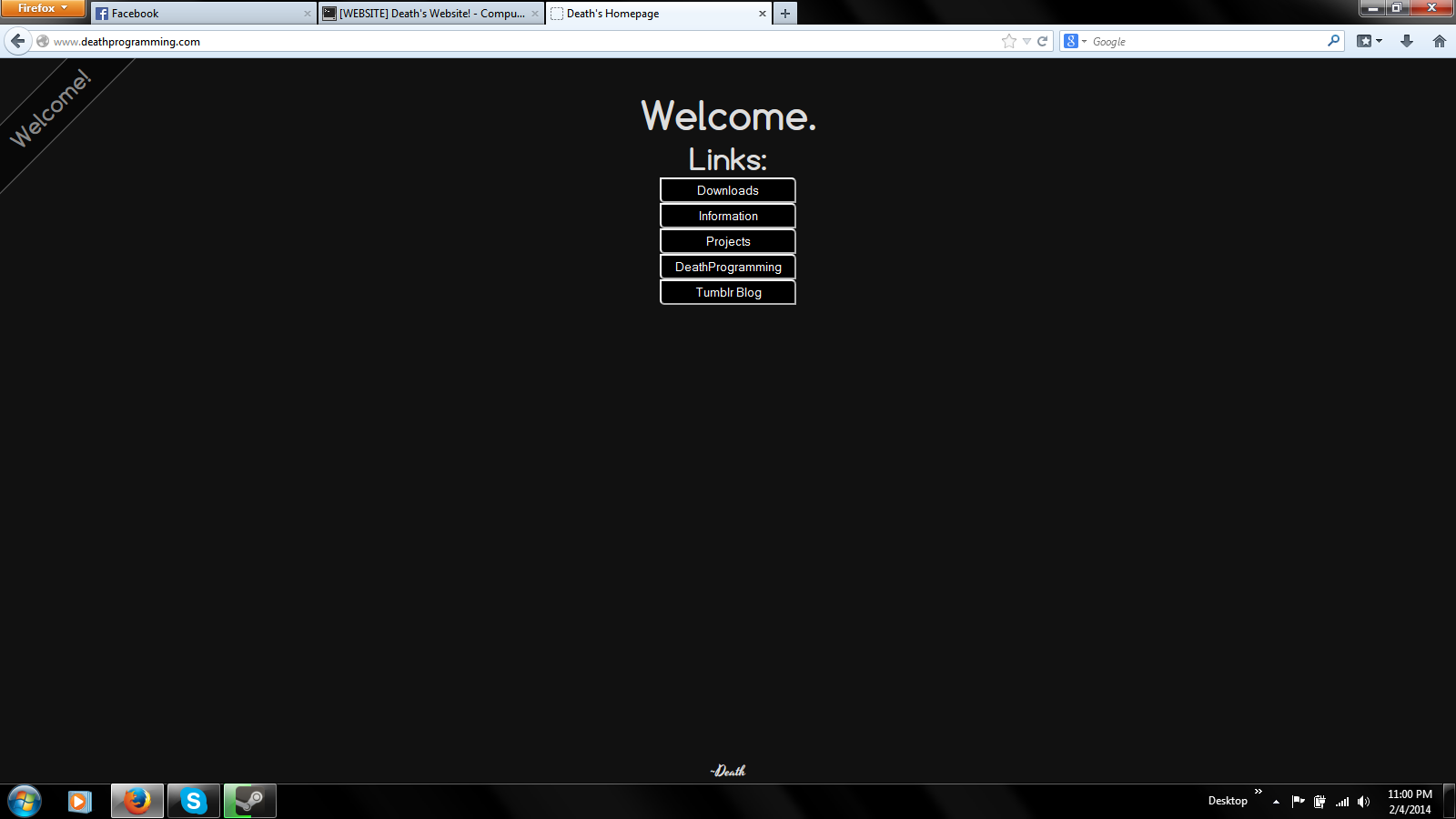
Hmmm, where on earth have I see that font before :P/>
Totally didn't see that - sorry :D/>
Anything else you think I should add?
To be honest, I'm not keen on the outline around the buttons. It looks a bit 90's 'Windows 95' like. Also, add a bit of margin between them so they're not all clumped together.
I've seen some websites where it pretty much reads: "Welcome to the links page, on this page of links you'll find links to other pages"
-mem snip-
bahaha! that's awesome! :P/>
boy am I glad that I've had
1. a good education in usability
2. enough common sense
to know that stating what you wrote above is just stupid and superfluous.
Yep.
Simplicity/Ease of use > Pointless amounts of content.
Having your site covered in crap, e.g.
this website (actually, it's not as bad as it used to be), makes the viewer confused leading them leave the website (or in the case of JB-HiFi's website, burn down every single store they have). Having a few simple buttons that are obvious as to where they go on a landing page makes your site easy to navigate, such as
this site (not a fan of the 5 second back and forward video though). This approach works particuarly well for performers or people who mainly use social media.
As in when hovering the mouse over them they look different. Take a look at the links in the navigation on
my site to see what I mean. btw if you do want to see how I've done something on my site it'll be easier if you look through the
repo than trying to explore the source in the browser.
You might want to considering making the font size a bit larger/change to 'Light' instead of 'Ultra Light', the navbar text doesn't look great for me (a non-Retina MacBook Pro).

Readability is paramount for navigation bars.


