1140 posts
Location
Kaunas, Lithuania
Posted 27 August 2014 - 02:42 PM
This is a repost of this topic.The reason I am re-posting the idea of this topic is:
A. It was locked and developers didn't say anything about it.
B. Everyone seemed to say Yes to this suggestion.
C. Screen characters should also be moved 1 pixel to the right too (it's the same case as with top and bottom).
For more information about this suggestion, please go to the
original post.
Edited on 27 August 2014 - 12:42 PM

8543 posts
Posted 27 August 2014 - 03:31 PM
This has been brought up a lot. Characters can already take up the whole space allotted to them, iirc. Try using characters that extend below the normal bottom rule (q, y, p, g, j). The screens are laid out about as well as they can be, to be honest. I don't see any easy improvements that could be made that would actually change anything for the better on the screens.

1140 posts
Location
Kaunas, Lithuania
Posted 27 August 2014 - 05:02 PM
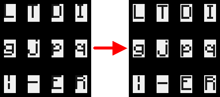
Here's my visualization of this change:

Also, here are some reasons taken from the original post:
Also, if the text is moved down, only the bottoms of letters with extensions (like j, g, p, q) will touch the bottom of the row.
If it was moved down a pixel, there would be a 1 pixel space on the top and bottom.
Also, the pipe character | seems to be vertically centered now.
This has been brought up a lot.
Are you sure you are not mistaken with
these kind of posts? My linked post was the only place I have ever seen someone talking about this weird character placement.
EDIT: sorry for double posting, normally when I make more than one post without leaving the page they get merged together, didn't work this time(?) :/
Edited on 27 August 2014 - 06:12 PM

8543 posts
Posted 27 August 2014 - 08:17 PM
Can you try setting the GUI to "Small" in the minecraft video settings? I wonder if there really are two pixels there to work with, or if the GUI scaling is behind the apparent 0-pixel/2-pixel offsets.
The automatic post merge is time-sensitive. I've manually merged them.

1140 posts
Location
Kaunas, Lithuania
Posted 27 August 2014 - 08:28 PM
I've seen that, and now I actually wonder if it is even possible to be done when on a medium-sized GUI. If it isn't possible, then there is another option, making the actual character box bigger, which I wonder why wasn't made like that in the first place. I really wonder why Dan didn't properly center characters when he made CC.
EDIT: whatever happens, at least moving characters down would help, because then, only the bottoms of letters with extensions (like j, g, p, q) will touch the bottom of the row, instead of every uppercase letter (and even more characters) touching the top of the row.
EDIT: ah, I can see why Dan made it like that. He wanted to make the space between characters as small as possible - one pixel. If you would put one pixel after another, the space between characters would be one pixel. Dan didn't plan to one day make the computer support colors, that is why he didn't think about the size of the character box.
Edited on 27 August 2014 - 06:45 PM


