290 posts
Location
St.Louis, MO
Posted 26 November 2014 - 08:30 AM

797 posts
Posted 26 November 2014 - 10:54 AM
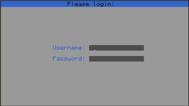
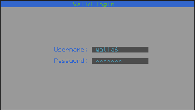
This certainly looks better that most login systems, good job.
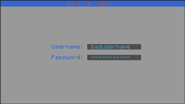
The only small improvement I can think of is the colour scheme. In my opinion, the light grey background looks pretty bad, maybe white would look better? The cyan on grey for the input fields looks really good though! I might have to use this somewhere.

290 posts
Location
St.Louis, MO
Posted 26 November 2014 - 02:59 PM
Thanks for the feedback.
I will start working on a customizable color scheme.

124 posts
Location
Seattle, WA
Posted 26 November 2014 - 11:36 PM
I feel like I'm looking at a '90s ncurses window, now there is nothing wrong with ncurses, infact ncurses was great, but I feel like it needs more bright colors, and less of the standard Gray/Blue color scheme. Also, it needs more of a reaction if you get the login correct or incorrect, see:
http://ux.stackexchange.com/questions/13516/how-to-tell-the-user-his-login-credentials-are-incorrect

290 posts
Location
St.Louis, MO
Posted 27 November 2014 - 03:33 AM
I feel like I'm looking at a '90s ncurses window, now there is nothing wrong with ncurses, infact ncurses was great, but I feel like it needs more bright colors, and less of the standard Gray/Blue color scheme. Also, it needs more of a reaction if you get the login correct or incorrect, see:
http://ux.stackexcha...s-are-incorrect
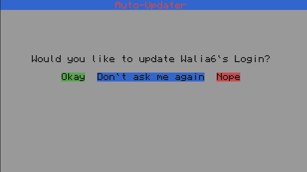
Ok I put a variable at the top of startup which defines which color you want as background. By default it is white. To get this update, reboot your computer and click Okay.
