656 posts
Posted 01 July 2015 - 10:50 AM
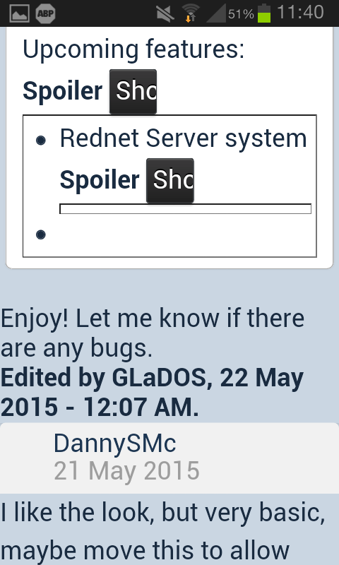
This topic looks like this on my android phone:

It seems to be a problem with the combination of a bullet list and a spoiler.
Are other people olso having this issue? Does it look normal on a pc? Is there any way to fix this?
Edited on 01 July 2015 - 08:51 AM

1023 posts
Posted 01 July 2015 - 12:26 PM
I noticed that topic acting strangely yesterday when I was looking at it. By strange i mean text such as "Enjoy! Let me know if there are any bugs. " being too far left (under his name/not confined to correct area). Along with at the bottom the place where it shows the users that are online is half off the screen on the left. This is the only topic on the forums that I have seen do this.

1140 posts
Location
Kaunas, Lithuania
Posted 01 July 2015 - 12:51 PM
One question. Are you using Chrome? Actually, it might be not only chrome. There's a 'feature' in some android browsers that scales all the text up by force, which brakes some websites. In chrome, sadly, you cannot disable it. That 'feature' really messes up some websites. The only solution I found was to go to 'Accessibility' in settings of the browser and set text scaling to the smallest value.

7083 posts
Location
Tasmania (AU)
Posted 01 July 2015 - 03:35 PM
Well, the BBCode in the post looks like this:
Upcoming features:
[spoiler][list]
[*]Rednet Server system
[spoiler]
Basically, this is a whole new version of AdvLock. You need at least two computers to run this. One is a client, one is a server. This will work as so: The client computer will send the password entered to the server. The server (based on user configuration) will determine if the password is right, and then send the client the command to run. The server can also handle multiple passwords: i.e. "password1" could boot into a custom built "safe mode" for guests, while "password2" could boot into the full shell.

The client will get a nice new UI that will include clickable buttons, and will be easily configurable.

Servers won't have as pretty as a UI (at first) and configuring might take a bit of work, but it should be relatively simple.

Update will release (at latest; I dunno when I can get it done) by May 23.
[*][/spoiler]
[/list]
[/spoiler]

Enjoy! Let me know if there are any bugs.
That second dot-point, just before the end of the nested spoiler, is what's causing the "Enjoy!" text to go out of whack.

8543 posts
Posted 02 July 2015 - 12:57 AM
I've removed the extraneous list point. The post looks fine to me now.
